Product page
Product blocks, variant pickers, the media gallery, sticky add to cart and per-product templates.
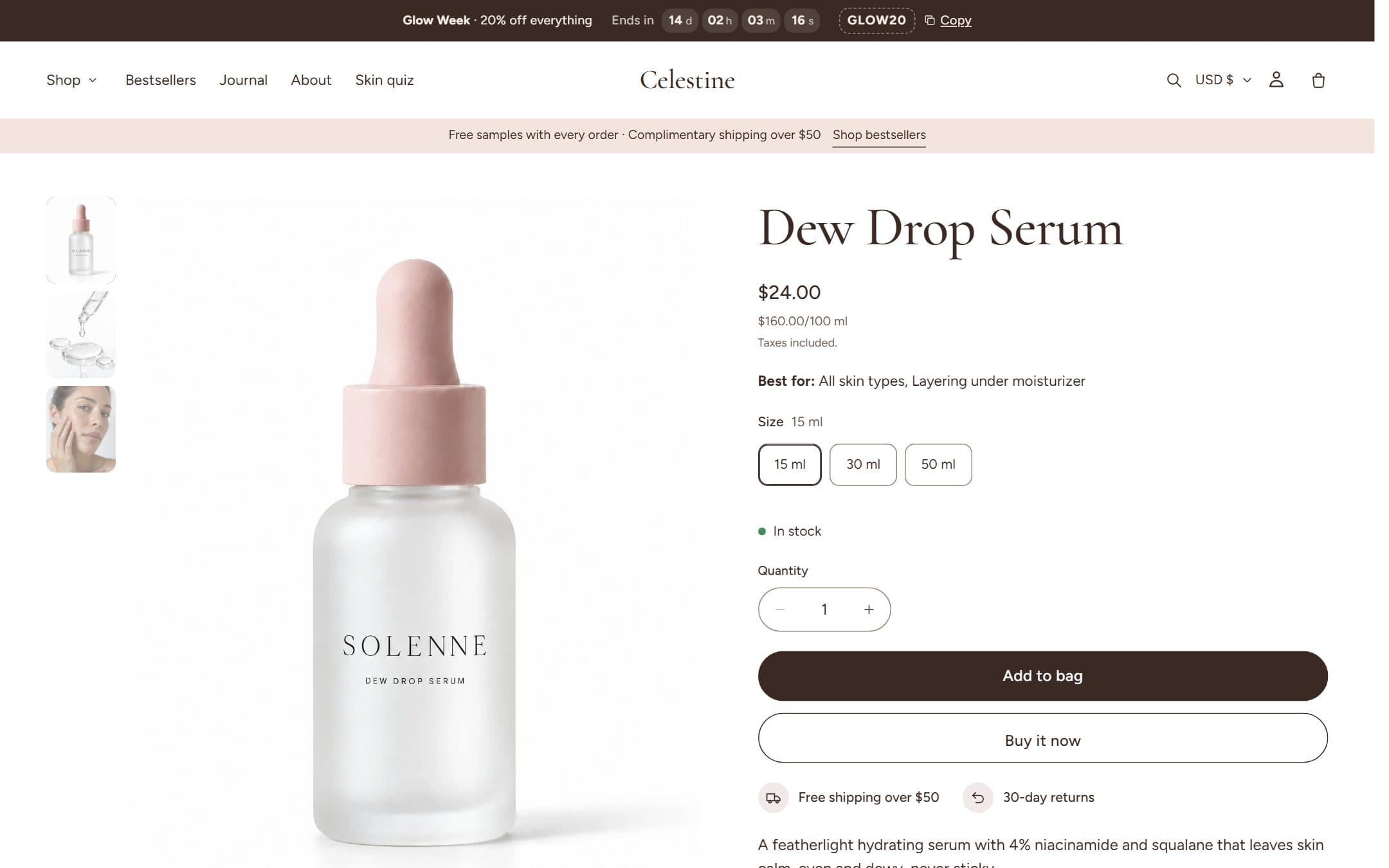
The product information section is built from blocks. Reorder them, hide the ones you don't need, or add the same block twice (two text blocks, for example).
Blocks
| Group | Blocks |
|---|---|
| Core | Title, Vendor, Price, Rating, SKU, Variant picker, Quantity selector, Buy buttons (with the Shop Pay Installments banner), Description, Inventory status, Pickup availability, Purchase options, Share |
| Beauty | Formula badges, Tags (skin type, concern), Results, Ingredients, How to use, Complete the routine |
| Details | Specifications, Fit, Size guide, Collapsible tab, Delivery estimate, Icons, Image, Text, Button |
| Gifting | Engraving, Gift wrap |
| Apps | Any app block from apps you install |
Variant picker styles
- Buttons: one button per value.
- Swatches: Shopify's native color swatches, falling back to the variant's image.
- Dropdown: compact, for long lists.
- Shades: a large swatch grid for foundations and lipsticks. Name values like
Warm / 110 Ivoryand Celestine groups them by undertone.
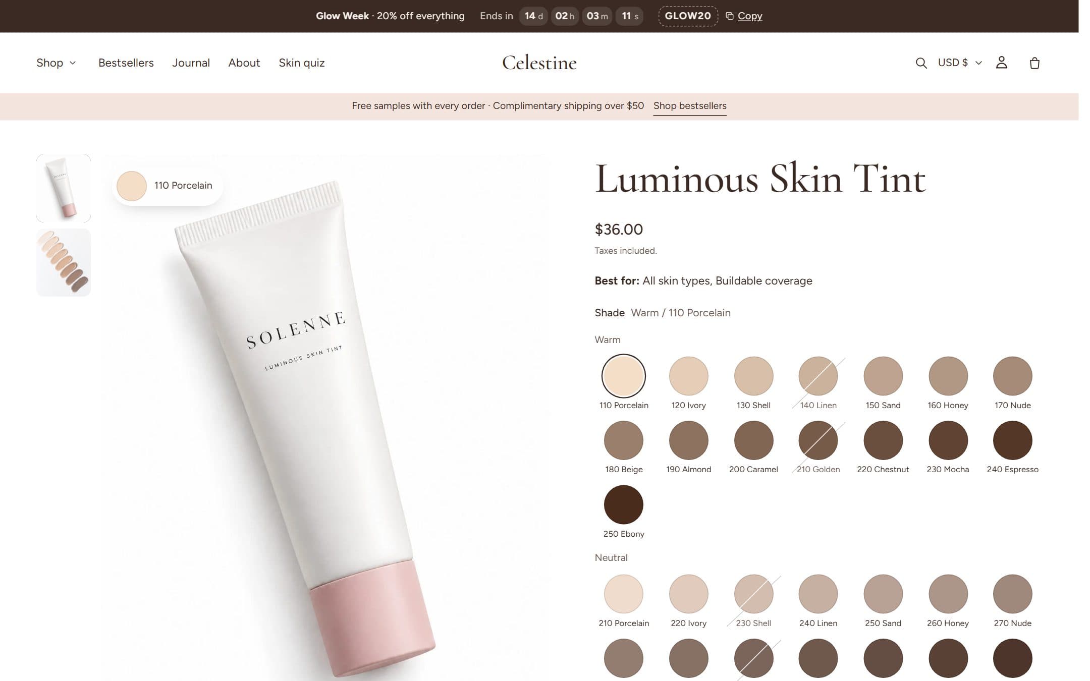
Sold-out values stay selectable but are struck through, so customers can still see the price and sign up for restock alerts from apps. The URL updates with the variant, so shared links open the right shade.
Media gallery
- Desktop layouts: carousel, carousel with thumbnails, grid, or a stacked column.
- Phones: swipeable slides with a counter, dots or thumbnails.
- Hover zoom, a fullscreen lightbox, and Shopify video, YouTube, Vimeo and 3D models that load only when played.
- The selected variant's image is shown first.
Sticky add to cart
Turn on Show sticky add to cart in the product section. It appears once the main buy button scrolls out of view and disappears when it's back. On phones it shows the product's options as dropdowns, so shoppers can switch variants without scrolling up.
| Setting | Options |
|---|---|
| Style | Floating card (rounded, frosted glass) or full-width bar |
| Position | Bottom of the screen or below the header |
| Alignment on desktop | Left, center or right (floating card only) |
| Show on | All devices, mobile only or desktop only |
| Product image and price | Show or hide each |
| Color scheme | Any of your color schemes |
Different layouts for different products
- 1In the editor's top bar, open the page selector and choose Products → Create template.
- 2Base it on the default product template and change what you need (for example add Ingredients and Results only for serums).
- 3In the Shopify admin, open a product and pick the new template under Theme template.
To show different ingredients, results or badges per product, connect those blocks to metafields. See Metafields.