Collections and search
Filter layouts, collection templates, the product grid and search results.
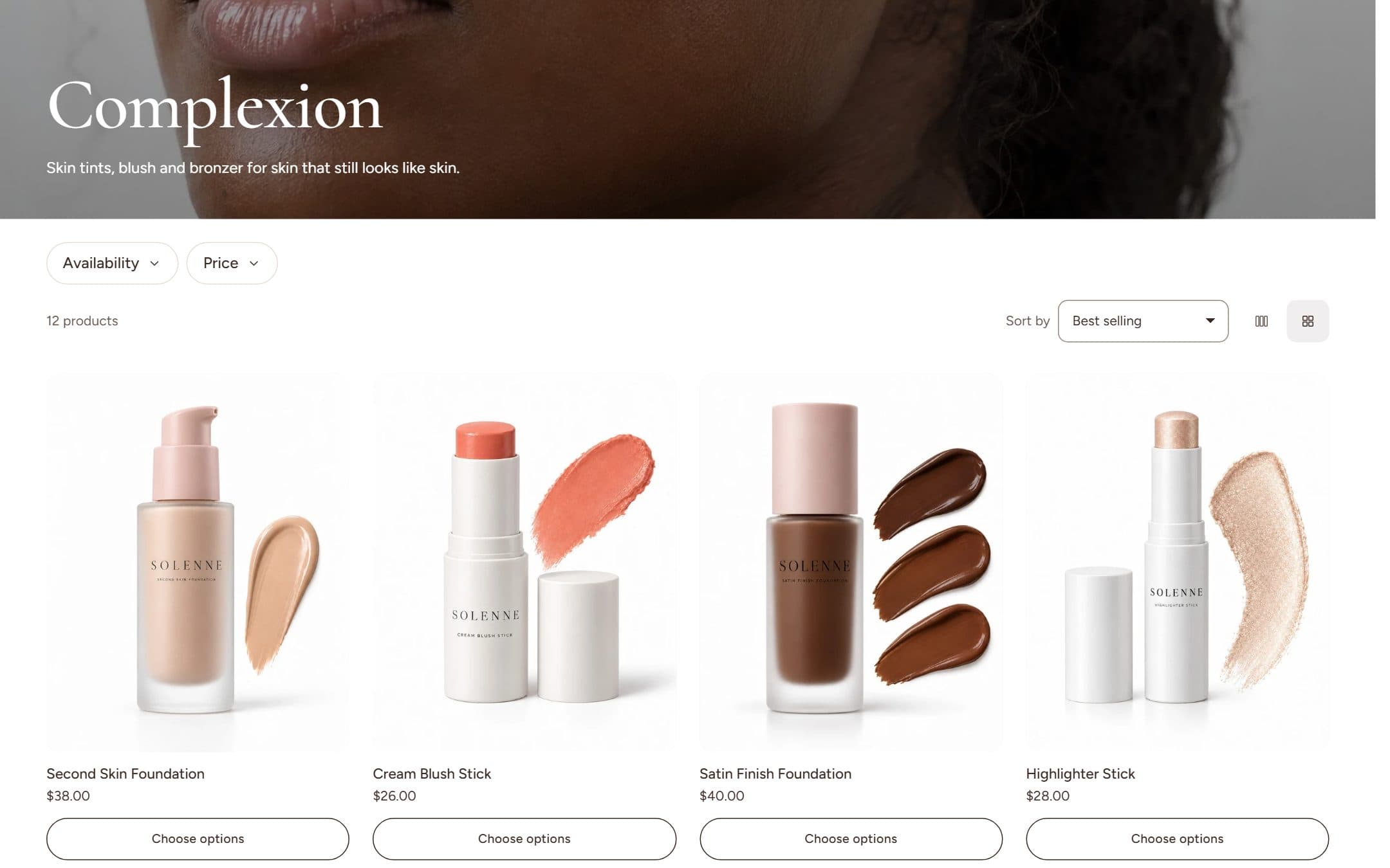
Filters
Filters come from Shopify's free Search & Discovery app. Install it, then choose which filters to offer (availability, price, product type, vendor, tags, variant options such as shade or size). Celestine shows exactly those.
| Desktop filter layout | Best for |
|---|---|
| Sidebar | Large catalogs with many filters |
| Horizontal bar | Fewer filters and a wider grid; each filter opens as a dropdown |
| Drawer | A clean grid with filters one click away |
On phones, filters always open in a drawer. Active filters show as chips with a Clear all link.
Collection templates
collection: sidebar filters, three columns, a promo tile, category tiles, a story and an FAQ below.collection.filters-top: horizontal filter bar, four columns and a product row below.
Assign a template to a collection in the admin under Theme template.
Product grid
- Products per page, columns on desktop (3 or 4) and on mobile (1 or 2). Shoppers can switch density themselves.
- Pagination: page numbers, a load-more button or infinite scroll.
- Promo tile: add a promo block to place an image card at any position in the grid.
- Reveal cards on scroll: cards below the first row fade in as they appear.
- Banner: the collection image with an adjustable overlay, title and description.
Search
Predictive search shows products, collections, pages and articles while the visitor types, fully usable with the keyboard. The search results page has tabs for each result type and the same filters as collections.